This case study for the design agency, BASIC, covers three major rebranding and content creation projects in one post:
- Rebranding the BASIC agency
- Creating the content for its digital portfolio
- Creative Direction & Content Creation for the agency’s 2016 Year-In-Review website.
The best place to begin is why BASIC wanted me to be part of their team. I was a partner and Creative Director for the creative agency Bonne Marque, and we had built a reputation for delivering award-winning and bold work in rebranding, design, web development, and content creation.
Matt, Managing Director at BASIC, was a big fan of our work and didn’t have an in-house writer who could deliver a similar tone for his agency. So I was brought in on a freelance, short-term contract (which eventually extended to 9 months) to build the new BASIC brand in the bold Bonne Marque style and create the content for their new portfolio.
My stay at BASIC extended the initial short-term plans because Matt wanted my involvement in a few client projects along the way, including the agency’s 2016 Year-In-Review website. I was offered a permanent contract, but I could not relocate to San Diego at the time.
Rebranding and content creation for a successful brand — bolder, fresher, and more modern attitude.
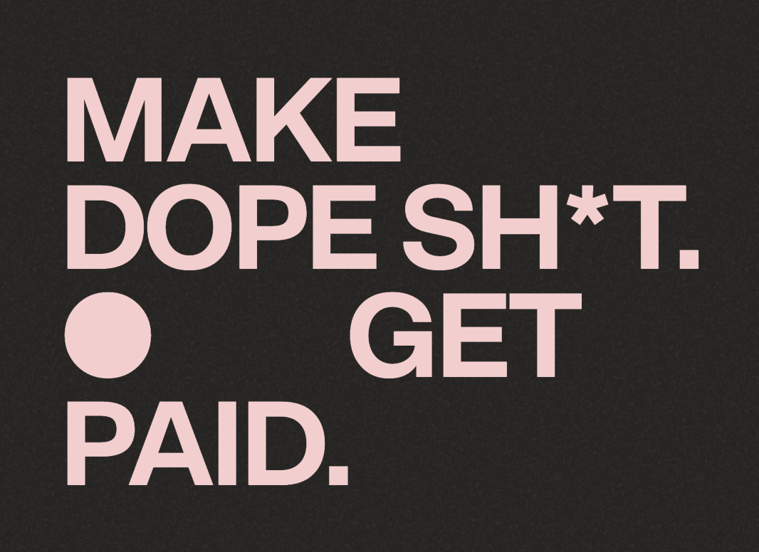
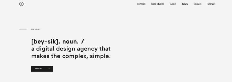
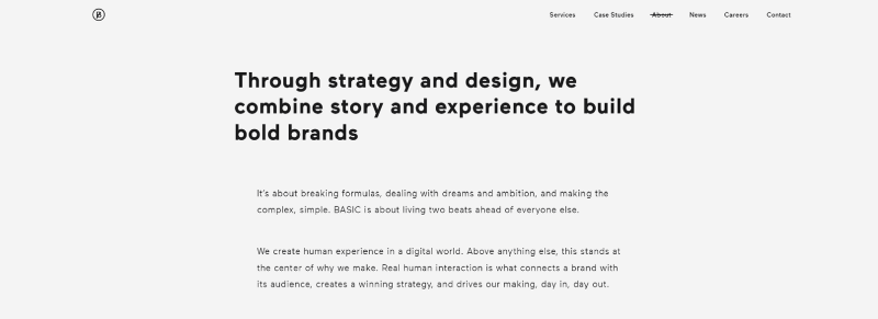
I’ll cut straight to the copy on the website and show how I implemented the new branding. BASIC wanted to stand out in the industry, so I created hero titles that no one else was doing. The following image is an excellent example of a unique concept expressing bold confidence. By using the ‘dictionary definition’ concept, the agency takes control of the word, BASIC, and the definition is simple but engaging, again expressing a confident attitude:
Some passages needed to ‘play it safe’ at the request of the BASIC management. I respected that they didn’t want to deter more conventional clients from using their service. However, I was careful not to lose any confidence I had created throughout the website. The following passage in the image below is a good reflection of playing it safe with a conventional beginning to the sentence but building upon that after the comma with confidence, attitude, and a little flair (the playful half-rhyme between ‘brands’ and ‘matter’ and the iambic rhythm of the second half of the sentence).
Powerful Simplicity
Quality writing was essential. I enjoy creating bold and disruptive content (while respecting clients’ expectations and consistently achieving good results). However, something I enjoy more and never compromise on is quality.
Quality writing is more than grammatical accuracy. Anyone with access to Grammarly can achieve that. Quality writing is about things an algorithm cannot measure. It’s about rhythm, structure, tone, wordplay, and breaking the rules when the right time comes. That’s what separates good writing from excellent. Excellent writers control language to such an extent that they can break its rules to make the words do more.
Story & Experience
The section above is an example of one of the more detailed passages on the site. The title is safe, born from a compromise to include some non-threatening copy for the conventional-thinking half of the audience. This passage was a piece I wrote with Kerouac as my main inspiration. A return to ‘beat culture’ felt appropriate with how I felt BASIC wanted to be thought of in its industry. Cool, creative, but popular. It’s not as wild as I first imagined. But I was happy to compromise the beat style in places to create the best copy for all involved.
Content writing that is simultaneously creating a new brand depends on a writer who can use simple words and make them do more. That’s where the magic happens. And that’s when personality comes through.
What title do you normally expect to find on an agency site? “Hello, we’re BASIC agency.” or “Introducing the team at BASIC.” Boring. Unimaginative and says nothing about the personality of the brand. Well, how about this one?
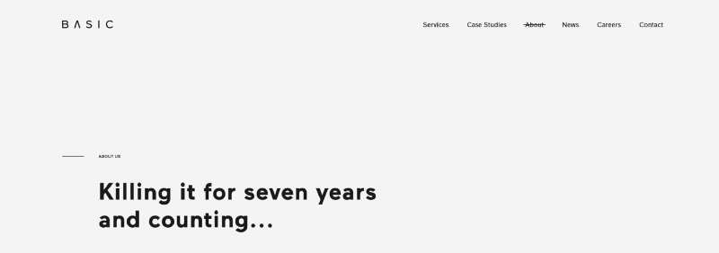
A beautiful rhythm, iambic pentameter, a sentence you haven’t seen on another agency site, perfectly in line with the new, bold rebrand, hip-hop and cool. Also, it’s a short title that shows that the people at BASIC agency measure their success by the success of their clients. This is one of my favourite lines on the site because it’s one of the best.
I’m proud of the title below. It’s always challenging to signpost a client list. My temptation is to go simple. A one-word title like ‘Brands’ or ‘Partners’ might have worked, but I wanted to do something special for BASIC.
Real Relationships over Business Transactions
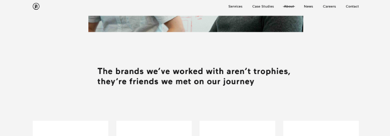
They have a powerful list of clients, and it deserved some original thinking. My title is modest and, I feel, consistent with the way BASIC thinks of its clients. They build long-term relationships with them based on creative hustle and honest work. My title expresses this like no other creative agency ever has.
Completing the portfolio with thoughtful and in-depth case studies
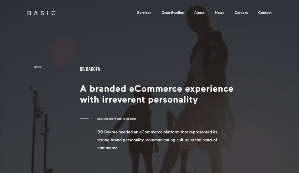
Like all portfolio sites, one of the most important functions of the BASIC portfolio was its case studies. My role was to understand what BASIC did for each client and create the content for the 20+ case studies.
I interviewed the key players who worked on each project and explored the projects myself to identify any key highlights that those involved may have missed. A fresh pair of outside eyes can see more than those closely involved for a long time.
As I mentioned at the start of this case study, I remained with BASIC for several client projects, so I ultimately created case studies for my own copywriting at the agency.
Each case study is representative of its subject; the Beats by Dre case study is full of Hip-Hop attitude, and the medical healthcare case study is far more professional. But each case study is, without doubt, BASIC in tone and delivery.
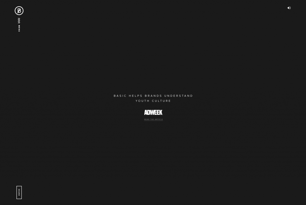
Cementing the BASIC brand with their 2016 Year in Review Website. Securing the rebranding and content creation project.
https://www.awwwards.com/sites/basic-year-in-review-2016
The BASIC 2016 Year-In-Review microsite – steeped in the theme of controlled chaos – reflected upon a remarkable twelve months for the agency in a confrontationally engaging fashion. The site was the bold underline that cemented the new, disruptive BASIC brand I had been instrumental in creating.
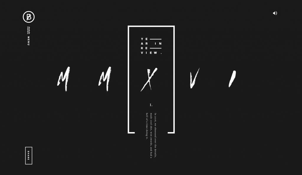
The concept is ‘controlled chaos and confrontation.’ Its purpose was to highlight the industry’s work while shocking the creative and digital advertising industry with the new style. At Bonne Marque, we set trends and never followed them. BASIC hired me to continue the bold, disruptive trend I had helped create at Bonne Marque. I chose to push the style further, and BASIC provided me with a much wider audience. The San Diego agency was far more established than Bonne Marque, with Beats by Dre, Fender, and Billabong amongst our impressive client list that year.
Reel
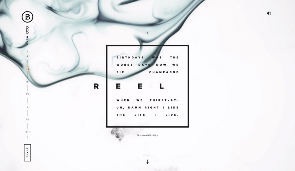
I used music to help me create the bold Bonne Marque style, selecting hip-hop as my muse. It perfectly suited the dark colour scheme and the bold, confrontational, confident, and underdog brand I wanted to create. BASIC’s 2016 Year-In-Review microsite has a soundtrack, also sharing lyrics by Notorious BIG, Public Enemy, Jay Z, and Kendrick Lamar. I’m proud that I helped BASIC connect to a hipper audience they couldn’t attack before. They had the visuals and the attitude, but they needed the writing. I made it happen for them with my rebranding and content creation services.